Today I uninstalled Cal, a calendar app for my android phone.
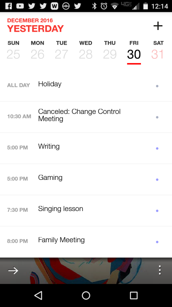
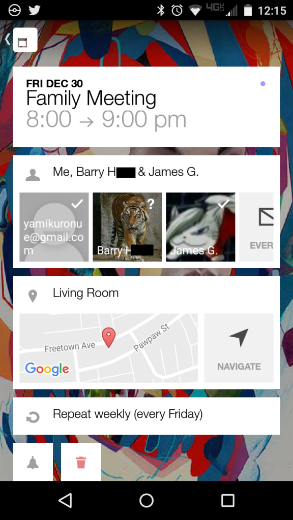
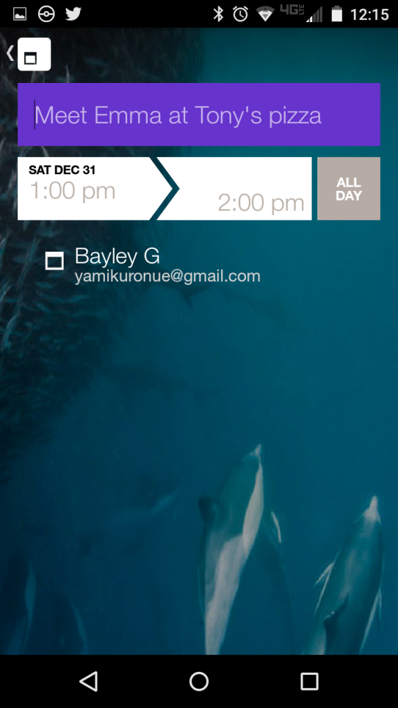
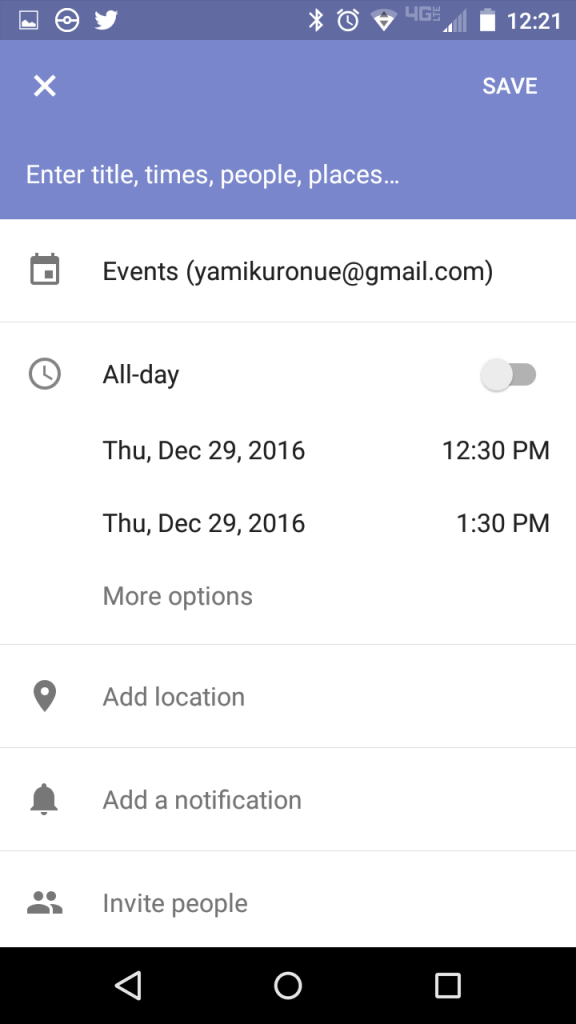
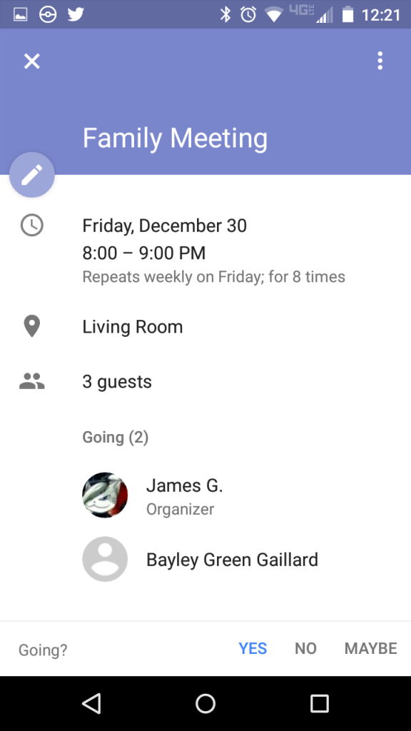
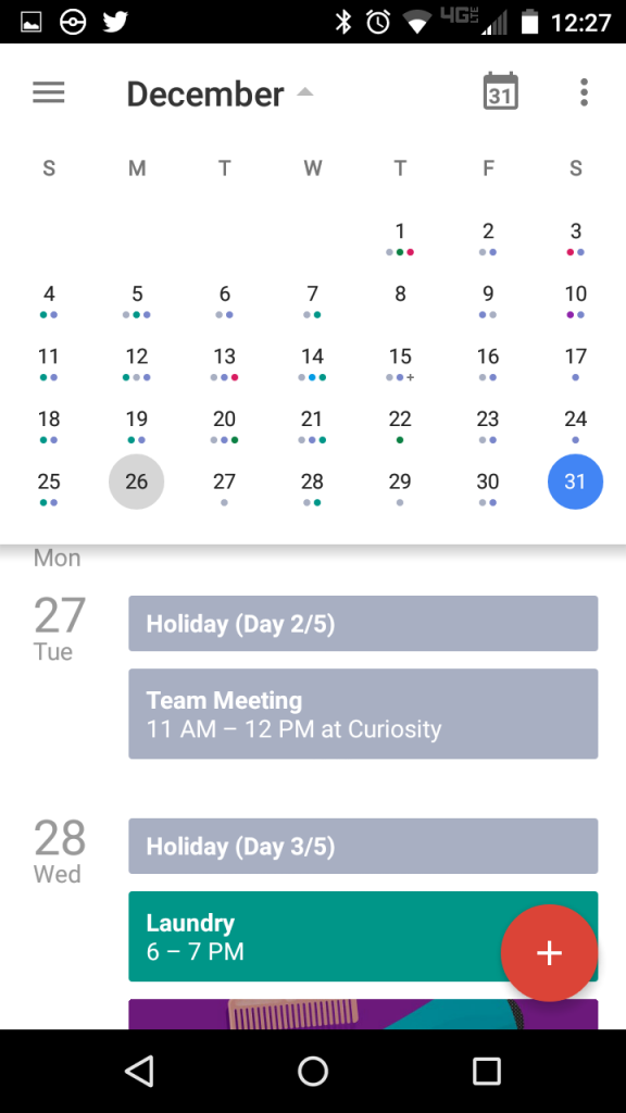
I liked Cal when I first installed it. It’s stylish, chic, and minimalist, as you can see from my below screenshots:
The problem is, these three screens I’ve shown you? Are the only real screens in the app, save a settings screen.
Do you see the problem yet?
How about this: when I got to my hairdresser next week, I’m going to want to schedule another appointment, 3 months out. How do I get there?
That little week strip at the top of the daily list scrolls… one week at a time. There is no “month at a glance” view, at least not that I can find. I’ve been using this calendar app for months, am reasonably intelligent, and work with computers all day long. I’m a heavy mobile user, since I’m often away from my computer and want information. But I can’t find any easier way to enter appointments a long time from now. This is an essential feature, and it’s missing (or so undiscoverable as to be practically missing), for no good reason.
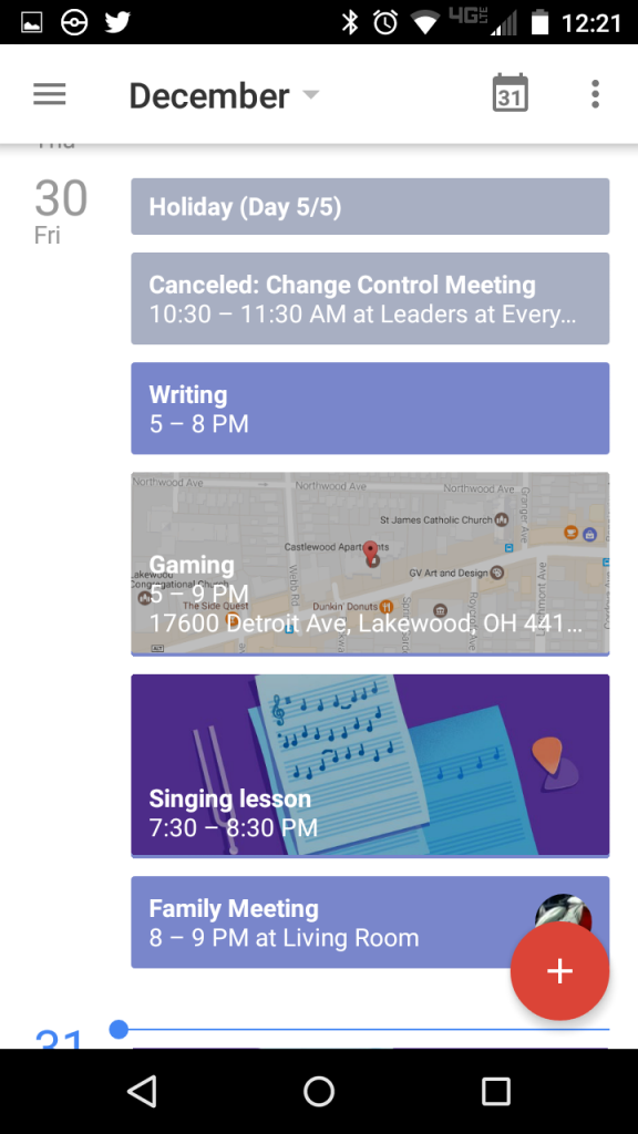
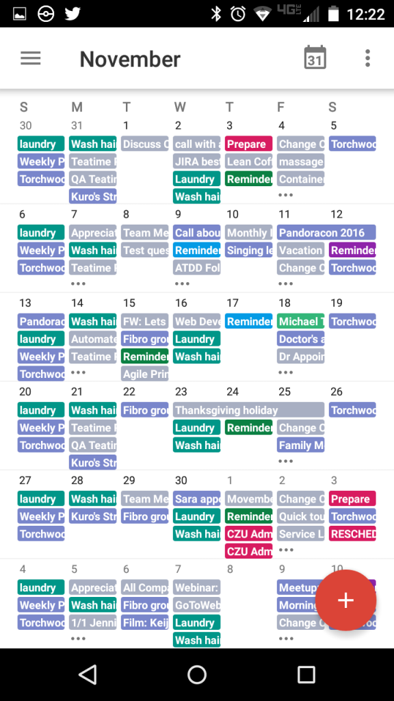
The same views in Google Calendar are not so elegant or artistic:
But it includes the following, crucial views of my month:
And that makes all the difference.
